A New Look for the Site
I’ve been using the same theme for this site since I rebuilt it (after a hiatus) in Hugo instead of Jekyll. The site has been running on the hello-friend-ng Hugo theme for years, with a growing pile of overrides and SCSS on top. This month I finally replaced it with a theme of my own.
It’s not like there was anything wrong with the Hello Friend theme, I actually still really like it, but my hacks on top were getting unmanageable, and I wanted something based on my own personal brand.
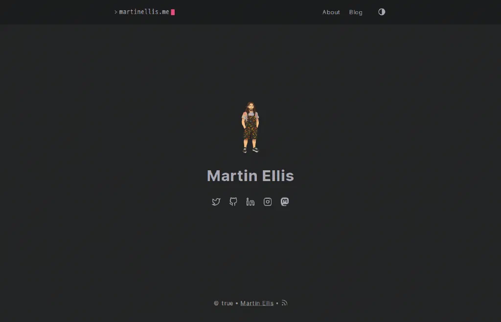
The old home page, on hello-friend-ng
A Theme of My Own
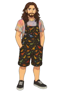
The colours are tie-dye design tokens drawn from my avatar, this was really the starting point, as well as looking for a more retro aesthetic. Choosing fonts was a bit of a pain, initial versions were using Silkscreen a lot more, but it was a bit too hard to read, chatting with a friend1, I was pointed at Departure Mono which fitted much better and is much easier to read2. All third party assets are vendored into the theme.
There’s no build step for the CSS or JS any more. The CSS is plain files that get concatenated and inlined into every page (Firefox could otherwise paint a page unstyled before the stylesheets arrived), and all the JS is one small file.
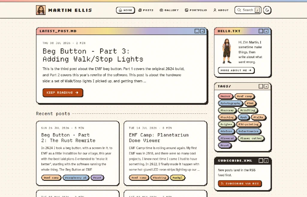
The new home page
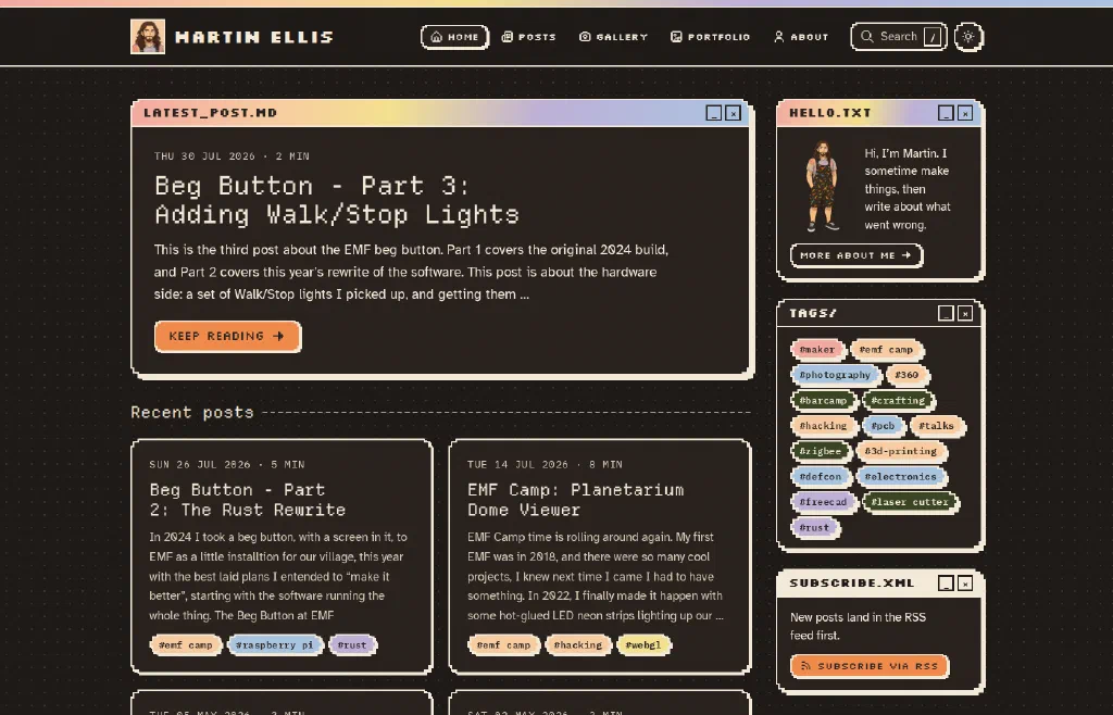
And in dark mode
Reading Posts
There has been some rearranging of the posts list page, with it now split into tabs by year, with search via Pagefind and a filter that narrows the list by title as you type.
Footnotes, which I use a lot3, now sit in the margin as sidenotes on wide screens, and hovering one highlights its number in the text (and the other way round). On narrow screens they pop up instead.
A Gallery
Photo-heavy posts have moved out of the blog into a new Gallery section, with redirects from their old addresses. Each gallery packs its photos into a grid at build time, with a notes tile, little pixel-art icons (from Pixelarticons and HackerNoon’s Pixel Icon Library) coloured from the photos to fill awkward gaps, and maps of where the photos were taken when they have GPS. The maps can be split by city, county or country, using an offline lookup built from GeoNames.
Clicking a photo opens a lightbox with its details, a small map and a full-screen zoom. Only resized copies of the photos are published, so the location and other metadata in the originals stays on my machine unless I choose otherwise.
The first new gallery is Women in Street Art, with photos from Fukuoka, Spain, the Netherlands and England.
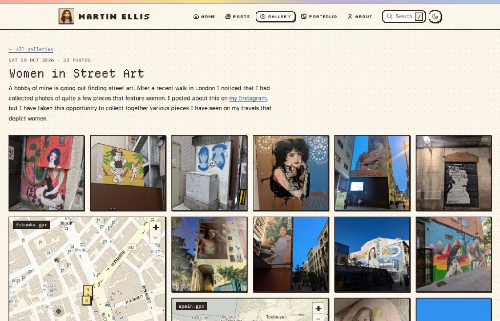
The top of the Women in Street Art gallery
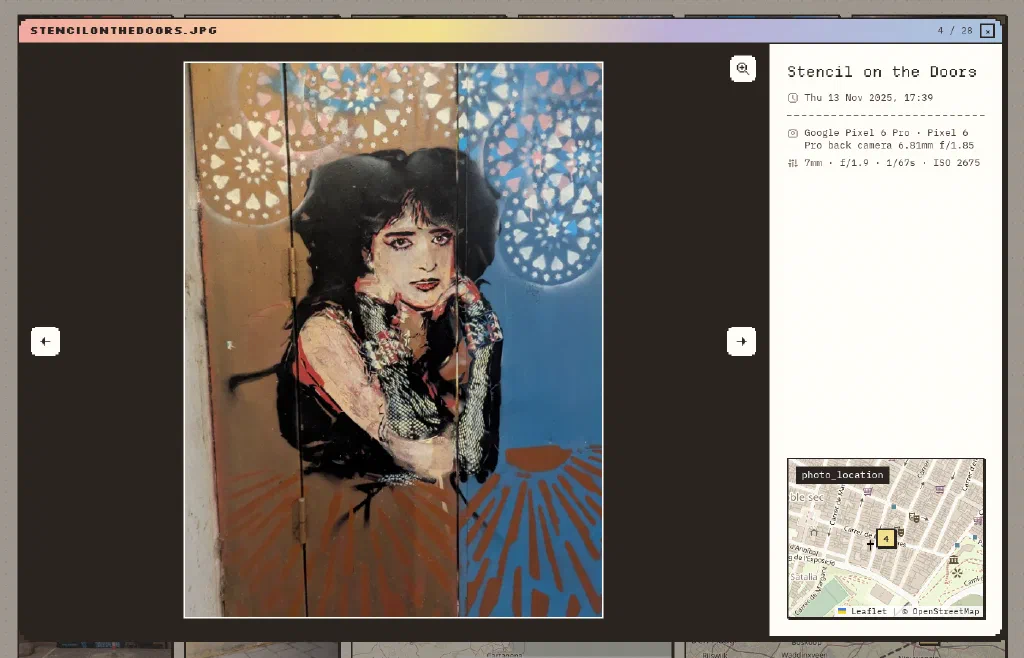
The lightbox, with photo details and a map
New Pages
There’s a Portfolio of projects, a rewritten About page and a Colophon that credits the fonts, icons and data the site uses. There’s a CV too, but that’s hidden for now.
The Less Visible Bits
A lot of the work went into things you hopefully won’t notice:
- The site works without JavaScript, following your system’s light or dark setting, and only the theme toggle and maps go missing.
- Images in posts get responsive sizes in WebP, and show their main colour with a little spinner while they load.
- Printing a page gives dark text on white without the site chrome, with link addresses written out and footnotes at the end. Galleries print with numbered map pins.
- There’s a skip link for keyboard users.
- Old addresses, like the paginated post lists from the old theme, redirect to their new homes.
- There’s a maintenance page for when the site is down.
Final Thoughts
I’m pretty happy with the design, but I am sure there will be some tweaks needed, if you find any issues, or have any feedback message me on any of the socials I would love to hear your thoughts.
-
Headings are set in Departure Mono, with Atkinson Hyperlegible for body text, and IBM Plex Mono, Silkscreen and VT323 for code and bits of UI. ↩︎
-
As you may have noticed. ↩︎